
Engineering / DH9062
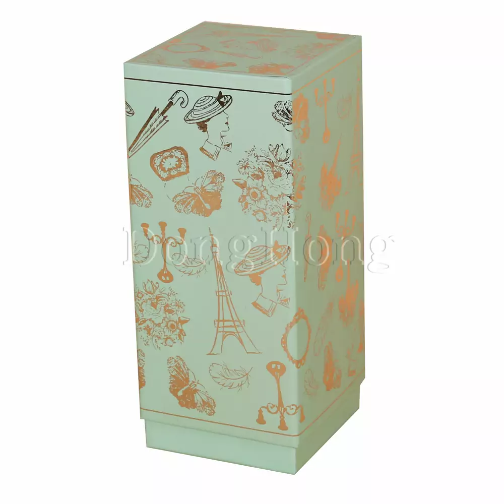
Upmarket Lid-off Wine Boxes with Cardboard Insert
Mounted from art paper and rigid cardboard materials |Ideal...
ReadNavy blue, but prints as royal blue? Let’s uncover the secrets behind custom packaging boxes..
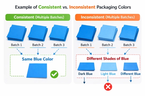
In the high-stakes world of B2B procurement, brand integrity is non-negotiable. However, one of the most frequent hurdles brand managers face is the visual gap between a digital mockup and the final custom packaging box delivered to their doorstep. This discrepancy isn't merely a matter of quality; it's a byproduct of physics.
Computer displays generate colors using the RGB (Red, Green, Blue) spectrum—an additive light model. Conversely, the physical manufacturing of a custom packaging box utilizes CMYK (Cyan, Magenta, Yellow, Black) pigments, which subtract light. Because the light-emitting capacity of a screen is vastly higher than the light-reflecting capacity of paper, certain vibrant tones simply cannot be perfectly mirrored in print.

Visualizing the Spectrum: Comparison chart of RGB (Digital) vs. CMYK (Physical Print) on Luxury Paper
The choice of substrate is a silent influencer in color fidelity. When producing a custom packaging box, the paper's texture and absorption rate play a pivotal role in the final look. For instance, "Coated" papers hold ink on the surface, maintaining crispness and vibrancy. "Uncoated" or specialized handmade papers absorb ink deeper into the fibers, which can mute the colors and shift the original Pantone intent.
Furthermore, different electronic devices—from iPhones to high-end monitors—have varying resolutions and color profiles. Relying on a screen for color approval is the primary cause of post-production dissatisfaction.
Why does a box look perfect in the factory but "off" in your retail showroom? The answer lies in the light source. Professional color matching requires standardized environments. International standards often dictate the use of D50 (5000K) for prepress and D65 (6500K) for finished product inspection in many regions.
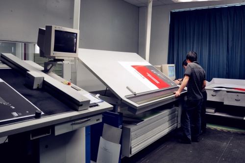
Factories that attempt "color matching" under nighttime artificial light or inconsistent natural light invite complaints. A true expert facility ensures that follow-color standards (跟色标准) are established using physical signatures rather than digital approximations.

The Light Booth Effect: A single custom packaging box viewed under D50 daylight vs. Fluorescent store lighting
To help you navigate these complexities, we have curated the most authoritative insights from across the web regarding color consistency for your custom packaging box projects:
This resource clarifies why digital files often contain "out-of-gamut" colors that no printer on earth can reach. It serves as a vital reality check for designers aiming for neon-bright branding on physical materials.
Centex highlights how screen brightness settings and environmental reflections create a false sense of color saturation. They advocate for physical proofs as the only reliable "source of truth."
Focusing on the "Delta E" measurement, this site explains that while 100% identity is impossible, professional manufacturers aim for a variance so small it is undetectable to the human eye under standard lighting.
This guide dives into the importance of using specific Pantone C (Coated) and U (Uncoated) guides. It explains how selecting the right ink formula for the right paper is the only way to protect brand identity across different custom packaging box production runs.
As a premier handmade factory, DHP Factory integrates technical science with artisan expertise. By strictly adhering to D50/D65 light source protocols and insisting on physical sign-off samples (跟色标准), DHP minimizes risk for global brands. Their focus on luxury handmade packaging means they account for material absorption factors that automated factories often overlook.
Our manufacturing facility understands that for a custom packaging box to be truly "premium," the color must be stable across 10,000 units. We mitigate "Screen-to-Box" variance by:
Conducting color matching only during optimal daylight hours or in calibrated light booths.
Comparing mass production against customer-approved physical signatures (跟色标准).
Providing expert guidance on how your chosen paper material will affect ink saturation before we start the machines.
Understanding the "why" behind color shifts empowers you to make better procurement decisions. By moving away from digital-only approvals and embracing physical standards, you ensure your custom packaging box represents your brand with absolute fidelity.
Work with a factory that speaks the language of color science. Let DHP Factory help you bridge the gap from screen to reality.
Consult Our Color Experts Now
Our engineers can help you transition to sustainable materials without compromising on luxury.
Get a Free Quote
Mounted from art paper and rigid cardboard materials |Ideal...
Read
Interesting design printing| Crafted from fancy paper| Cus...
Read
Interesting design finishing|Crafted from red fancy paper|Ad...
ReadShare your specs or design files in minutes — we’ll reply within 24 hours with a clear quote, recommended materials, and feasible finishes.
Prefer email? Reach us at mkt@dhpfactory.com.