
How to Prevent Color Differences Between Packaging Samples and Mass Production
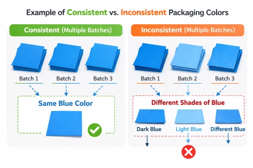
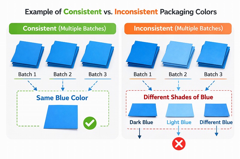
Your custom packaging sample arrives with the perfect brand color. The surface looks clean, the logo is accurately printed, and the packaging is approved. But when the mass-produced boxes arrive, the blue appears darker, the red looks warmer, or a large solid-colored area shows visible variations.
Packaging color differences are a common concern for beauty, fragrance, spirits, and luxury brands. The problem is not always poor printing. Digital proofs, offset presses, paper substrates, ink formulations, and surface finishes can produce different visual results.
Achieving reliable packaging color consistency requires a defined reference, suitable printing processes, controlled materials, and documented inspection methods. This guide explains how manufacturers and brand owners can reduce color deviations from sampling through mass production.
1. Why Do Packaging Samples and Mass Production Look Different?
Packaging colors can change because the printing conditions used for a prototype differ from those used during commercial production. Even when the artwork is identical, changes in ink, substrate, printing technology, finishing, or viewing conditions may affect the result.
Common sources of color variation include:
Digital printing used for sampling and offset printing used for production.
Different paper grades, coatings, textures, or paper whiteness.
Variations in ink density, printing profiles, and press conditions.
Matte or gloss lamination changing the appearance of printed areas.
Comparing packaging under inconsistent lighting conditions.
Approval based only on screen images rather than physical references.
Because several variables may affect the same printed color, the manufacturer and buyer should identify the most critical brand colors before choosing the sampling method.
2. Digital Proof vs. Offset Printing: Why the Colors May Not Match
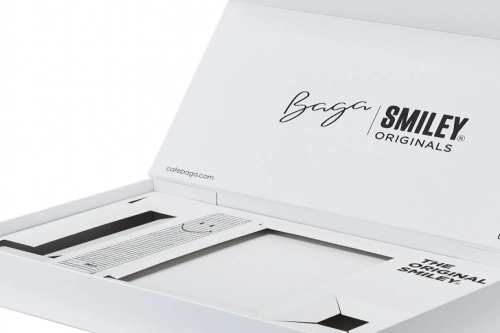
Digital printing is useful for producing short-run packaging samples, evaluating artwork, and checking the general appearance of a design. It offers flexibility without the same plate-making requirements as conventional offset printing.
However, digital printing and offset printing use different imaging and color reproduction systems. A digital sample may therefore reproduce certain shades, gradients, or solid colors differently from the final offset-printed packaging.
What Should a Digital Sample Be Used For?
A digital sample is valuable for reviewing layout, typography, artwork placement, overall appearance, and structural presentation. Unless a specific color-matching procedure has been agreed upon, it should not automatically be treated as the definitive color standard for offset mass production.
When Is an Offset Press Proof Necessary?
For projects with demanding brand-color requirements, a proof produced using the intended offset process and selected substrate can provide a more representative reference.
The additional proofing cost may be justified for large production runs, luxury packaging, repeat orders, or designs featuring prominent solid brand colors.
For a broader explanation of prototype types, read our custom rigid box sampling and approval guide .
3. CMYK vs. Pantone: Which Is Better for Brand Color Consistency?
CMYK printing combines cyan, magenta, yellow, and black inks to reproduce photographs, illustrations, gradients, and complex designs. It is widely used for commercial packaging.
Pantone spot-color printing uses a defined color reference and dedicated ink formulation. It can offer more controlled reproduction for selected solid brand colors, although the final result still depends on printing conditions and the substrate.
| Comparison | CMYK Printing | Pantone Spot Color |
|---|---|---|
| Best Application | Photography, gradients, multicolor artwork | Critical logos and solid brand colors |
| Color Reference | Process-color values and managed profiles | Defined spot-color reference |
| Color Control | Requires controlled process conditions | Supports targeted solid-color matching |
| Production Cost | Efficient for full-color artwork | May require additional ink and setup |
| Important Limitation | Some colors fall outside the CMYK gamut | Still influenced by paper and finishing |
For premium packaging, a practical solution is often to combine CMYK printing for complex graphics with a selected Pantone spot color for a critical logo or brand background.
The choice should be made during artwork preparation rather than after an unexpected color difference appears.
4. How Paper Materials and Surface Finishes Affect Printed Colors
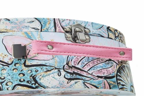
Identical ink does not necessarily look identical on different packaging materials. Coated art paper, uncoated paper, textured specialty paper, and kraft paper have different surface characteristics and base colors.
An ink printed on a smooth white coated sheet may look brighter than the same ink on a porous, warm-toned paper. Surface treatments introduce another variable.
Matte and Gloss Lamination
Gloss lamination can increase perceived contrast and saturation, while matte lamination may create a softer appearance. Soft-touch films and varnishes may also influence color perception.
Specialty Paper and Texture
Textured paper can affect ink coverage and reflected light. For luxury rigid boxes using specialty wrapping paper, material selection should be confirmed before approving the final printed color.
Explore DHP Factory's printing and surface finishing options when comparing CMYK, spot colors, lamination, foil stamping, and decorative finishes.

5. Six Steps to Improve Packaging Color Consistency
Step 1: Define the Critical Brand Colors
Identify the colors that require the closest control, especially logos and large solid backgrounds. Provide suitable Pantone references or approved physical standards where available.
Step 2: Confirm the Final Paper and Finishing
Use the intended production substrate during important color approvals. A proof on different paper may not accurately represent the finished packaging.
Step 3: Agree on the Purpose of Each Sample
Distinguish structural white samples, digital artwork proofs, actual press proofs, and pre-production confirmation samples. Each serves a different approval purpose.
Step 4: Establish a Physical Color Reference
The approved reference should be clearly identified and retained for production comparison. When instrumental tolerances are required, agree on the measurement method, lighting conditions, and acceptable color difference.
Step 5: Monitor Color During Printing
Regular press checks and spectrophotometer measurements can help identify color drift before it affects a larger quantity of printed sheets. The inspection frequency should reflect the project and production conditions.
Step 6: Inspect the Finished Packaging
Compare completed boxes with approved references after lamination, wrapping, and assembly. Final appearance matters because the buyer receives finished packaging rather than unfinished printed sheets.

6. How DHP Factory Manages Color From Sampling to Mass Production
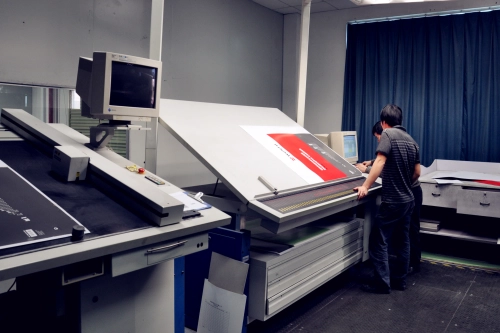
As a China-based custom packaging manufacturer, DHP Factory combines Heidelberg offset printing equipment with X-Rite color measurement technology to support more consistent printing across commercial packaging projects.
Its published manufacturing workflow includes artwork review, sampling strategy, approved physical references, material preparation, offset printing, in-process inspection, surface finishing, and final quality checks.
DHP Factory also publishes a ΔE below 2.0 as an internal color-control target and describes periodic color checks during production. For each order, the applicable acceptance criteria should be confirmed against the agreed color reference, substrate, finishing, and measurement conditions.
Learn more about the equipment and manufacturing workflow in our smart manufacturing and quality control overview .
Why Pre-Production Confirmation Matters
For luxury rigid boxes, color approval should consider not only the printed surface but also the finished packaging construction. Matching the intended paper, printing process, and surface finish helps reduce avoidable differences.
Color is also one of several potential manufacturing risks. Our guide to common rigid box manufacturing defects and prevention explains other issues that should be reviewed before approving mass production.
7. What Should Buyers Confirm Before Mass Production?
Before approving a packaging production order, confirm the following details with the manufacturer:
Final artwork files and specified brand colors.
CMYK or Pantone printing requirements.
Approved paper type, texture, and surface treatment.
Whether digital samples are for appearance approval or color approval.
Availability of an offset press proof or pre-production sample.
Approved physical color reference and relevant tolerance criteria.
Production color inspection and acceptance arrangements.
Color consistency requirements for future repeat orders.
Clear specifications reduce misunderstandings and give both the buyer and manufacturer a more objective basis for evaluating the result.
8. Frequently Asked Questions
Why does my packaging color look different from the approved digital sample?
Digital and offset printing use different color reproduction systems. Paper, ink, profiles, and surface finishing can also change the final appearance.
Is Pantone printing always more accurate than CMYK?
Pantone spot colors are useful for controlling certain critical solid colors, but neither method guarantees a perfect match under every production condition. The correct choice depends on the artwork and requirements.
What does Delta E mean in packaging printing?
Delta E (ΔE) describes a numerical color difference between a measured sample and a reference. Results depend on the chosen color-difference formula and measurement conditions.
Can matte lamination change packaging colors?
Yes. Matte, gloss, soft-touch, and other finishes can influence the perceived color and contrast of printed areas.
How can brands maintain color consistency across repeat orders?
Retain approved physical and digital references, document material and finishing specifications, use comparable measurement conditions, and verify colors during each production run.
Need Consistent Brand Colors for Your Custom Packaging?
DHP Factory supports international brands with custom rigid boxes, offset printing, Pantone color matching, decorative finishing, sampling, and production quality control.
Share your packaging artwork, brand color references, selected materials, dimensions, and estimated order quantity. Our team can discuss suitable printing methods and sampling options for your project.